
The Ultimate Guide to Icon Sets: From Pixels to Perfect User Experience
The Silent Language of the Web: Why Icon Sets Are More Than Just Decoration
In the fast-paced digital world, communication needs to be instant. Before a user reads a single word of your copy, they've already scanned your interface, making snap judgments based on layout, color, and—perhaps most importantly—icons. These tiny graphical elements are the unsung heroes of user experience (UX). They are a universal language, transcending cultural and linguistic barriers to provide clarity, guidance, and even a touch of personality.
An icon set isn't just a random collection of images; it's a cohesive visual system. Think of it as a specialized font, where each character is a symbol with a specific meaning. A well-chosen icon set can transform a confusing interface into an intuitive one, guide users effortlessly through complex workflows, and reinforce your brand's identity with every click and tap.
Conversely, a poorly chosen or inconsistent set of icons can create chaos. Mixing styles, using ambiguous symbols, or employing low-quality graphics can frustrate users, increase cognitive load, and make your application feel cheap and untrustworthy.
In this guide, we will embark on a comprehensive journey into the world of icon sets. We'll explore:
- The core benefits of using a unified icon set.
- The different types and styles available, from line to filled to duo-tone.
- Critical file formats (SVG, Icon Fonts, PNG) and when to use them.
- A practical framework for choosing the perfect icon set for your project.
- Technical implementation methods for web developers.
- A curated list of the best free and premium icon resources.
- Advanced best practices, including accessibility and custom iconography.
Whether you're a designer crafting a new app, a developer implementing a front-end, or a product manager overseeing a digital product, understanding the power of icon sets is non-negotiable. Let's get started.
The Power of a Unified System: Key Benefits of Using Icon Sets
Investing time in selecting or creating a high-quality icon set pays dividends throughout the entire product lifecycle. It’s a foundational design decision that impacts usability, branding, and development efficiency.
1. Enhanced Usability and Scannability
Human brains are wired to process images far faster than text. Icons act as visual signposts that allow users to navigate and understand an interface at a glance.
- Quick Recognition: A universally understood symbol, like a magnifying glass for "search" or a trash can for "delete," requires zero reading. This speeds up user interaction and reduces the mental effort needed to use your product.
- Spatial Efficiency: Icons can convey complex actions or ideas in a very small space. This is crucial for mobile interfaces, dashboards, and toolbars where screen real estate is at a premium. A cog icon for "settings" is much more compact than the word itself.
- Improved Information Hierarchy: By using icons alongside text labels, you create a richer, more scannable layout. The icon draws the eye, and the text provides confirmation, catering to both quick scanners and more cautious users.
2. Unbreakable Brand Consistency
Your brand is more than just a logo and a color palette. It's the sum of all interactions a user has with your product. A consistent icon set is a powerful tool for reinforcing your brand's visual identity.
- Visual Harmony: When every icon shares the same line weight, corner radius, and stylistic elements, it creates a sense of order and professionalism. This visual harmony makes the entire application feel more polished and cohesive.
- Brand Personality: Are you a playful, modern startup? Rounded, friendly icons might be your fit. Are you a serious financial institution? Sharp, precise, line-based icons would be more appropriate. The style of your icons communicates your brand's personality subliminally.
- Building Trust: Consistency builds familiarity, and familiarity builds trust. When users see the same visual language used across your website, mobile app, and even marketing materials, it reinforces the sense that they are interacting with a single, reliable entity.
3. Streamlined Design and Development Workflow
Using a pre-defined icon set is a massive efficiency boost for both design and development teams. It eliminates guesswork and ensures everyone is working from the same playbook.
- Single Source of Truth: An established icon library acts as a central repository. Designers don't have to create new icons for every feature, and developers know exactly where to pull assets from. This prevents the "Frankenstein" effect of mismatched icons creeping into the product over time.
- Faster Prototyping and Mockups: Designers can quickly drag and drop established icons into their layouts, speeding up the entire design process. They can focus on solving larger UX problems instead of getting bogged down in creating one-off symbols.
- Component-Based Development: In modern front-end development, icons are treated as reusable components. A developer can create a single
<Icon name="cart" />component that can be used anywhere in the application, ensuring consistency and making future updates trivial.
Anatomy of an Icon Set: Styles, Formats, and Licensing
Before you can choose an icon set, you need to understand the fundamental characteristics that define them. These can be broken down into three main categories: visual style, technical format, and usage license.
Visual Styles: The Personality of Your Icons
The style of an icon set is its most noticeable attribute. It should align with your brand's overall aesthetic.
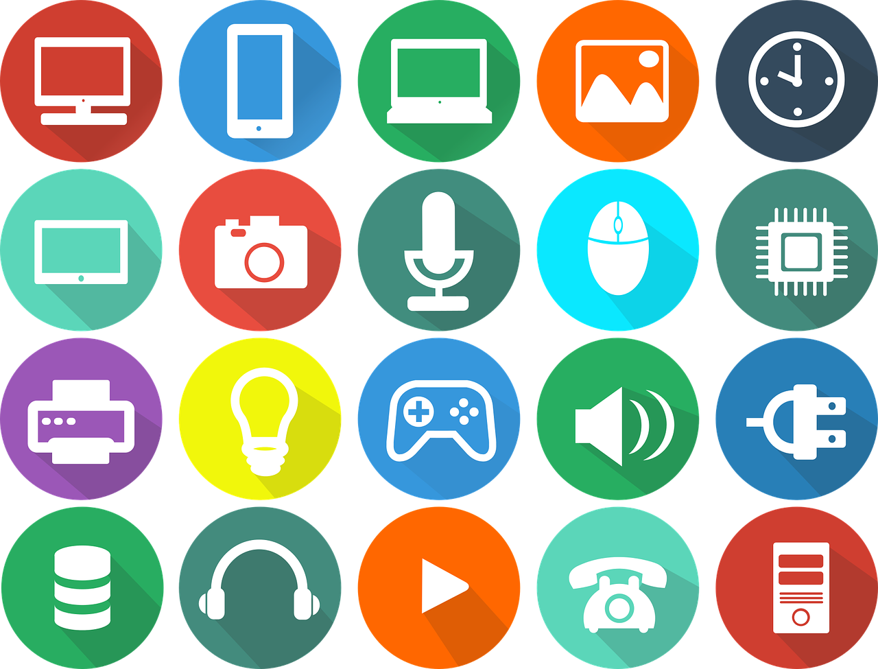
- Line (or Outline): These icons are constructed from strokes of a uniform weight. They feel light, modern, and elegant. They are extremely popular in minimalist designs and work well at various sizes. Example: Feather Icons.
- Filled (or Solid): These icons are filled with solid color. They have a stronger visual presence and are often more immediately recognizable, especially at smaller sizes. They can feel bold, friendly, and substantial. Example: The solid style of Font Awesome.
- Duo-tone: A more recent trend, duo-tone icons use two complementary colors to create depth and visual interest. One color typically forms the main shape, while the second acts as an accent. This style can make an interface feel vibrant and unique.
- Glyph: This is a broader term, but often refers to simple, solid, monochromatic shapes, similar to characters in a font. They are typically very bold and work best for conveying simple, direct actions.
- Hand-drawn or Sketched: For brands that want to project a more organic, creative, or informal personality, hand-drawn icons are a great choice. They break the mold of clean, geometric digital design and can add a lot of character.
Technical Formats: How Icons Are Built and Delivered
The file format of your icons has a massive impact on performance, scalability, and ease of implementation.
-
SVG (Scalable Vector Graphics):
- Pros: This is the modern standard for web icons. As a vector format, SVGs are infinitely scalable—they look perfectly crisp on any screen, from a small phone to a 5K retina display. They are incredibly lightweight, can be manipulated with CSS (changing color, size, stroke), and can even be animated. They are also great for accessibility as the code can be read by screen readers.
- Cons: Can be slightly more complex to implement than other methods if you're not familiar with them. Older browsers (like IE8 and below) have poor support, but this is largely a non-issue today.
-
Icon Fonts:
- Pros: An icon font bundles hundreds of icons into a single font file (like
.woff2). You can then use CSS to display them, just like any other text character. This was a very popular method and is still used by libraries like Font Awesome. They are easy to style with CSS properties likecolorandfont-size. - Cons: They can have accessibility issues if not implemented carefully (screen readers might try to read them as strange characters). They are strictly single-color (unless you use complex workarounds). Sometimes, font rendering can be inconsistent across browsers, leading to icons appearing slightly blurry or misaligned. SVGs have largely superseded them as the preferred method.
- Pros: An icon font bundles hundreds of icons into a single font file (like
-
Raster Images (PNG, GIF):
- Pros: The simplest format to understand. It's just an image file you place with an
<img>tag. They are universally supported. - Cons: This is generally the worst option for interface icons. Raster images are pixel-based, meaning they cannot scale without losing quality and becoming blurry. You need to create different sizes for different screen resolutions (
icon.png,icon@2x.png,icon@3x.png), which is a maintenance nightmare. They cannot be easily styled with CSS, and managing many small image files can lead to a high number of HTTP requests, slowing down your site.
Avoid using PNGs for UI icons whenever possible.
- Pros: The simplest format to understand. It's just an image file you place with an
Generate by Gemini 2.5 Pro